


Visual Identity, webdesign and web development for a boutique hotel managment service
Petr Marek, a seasoned international hotel manager, envisioned a new venture, Encore Hospitality, to leverage his extensive experience and connections in supporting local boutique hotels. My challenge was to develop a sophisticated visual identity and a simple, yet compelling, introductory website that would establish trust and resonate with his target clientele: discerning managers and owners of smaller, luxurious boutique hotels.
From our initial conversations, a key guiding principle emerged: "quiet luxury." Petr wanted the brand to exude high-end class and sophistication while retaining a sense of conservatism and discretion, a subtle elegance that speaks volumes without being ostentatious. This core concept informed every design decision.
Our collaborative process began by immersing ourselves in the world of luxury hospitality and classical aesthetics, ultimately refining our focus through mood boards and design explorations.
Client
Encore Hospitality
My Role
Graphic Designer, Front-End Developer
Services
Logo design, Web Design, Branding, Front-End Development
Year
2019 – 2024
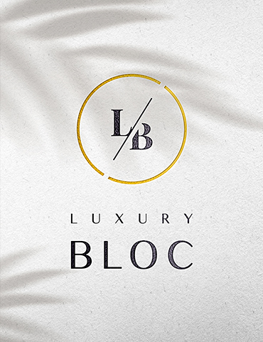
Logo Design
The Encore Hospitality logo elegantly combines classical art-deco elements with modern features. It comprises a distinctive logo-mark and a refined word-mark. The logo-mark is a carefully crafted fusion of the "E" and "H" initials, forming a unique and memorable symbol. This versatile mark also served as the foundation for a custom pattern element, allowing for consistent brand application across various touchpoints.
For the word-mark, I selected a condensed sans-serif typeface, echoing the elongated, vertical style and clean geometric shapes characteristic of art-deco design. This choice imbues the brand with a timeless yet contemporary feel.
The primary color of the logo features a subtle golden gradient, carefully chosen to evoke glamour and sophistication. This rich hue mimics the luxurious materials often found in art-deco interiors, instantly communicating the brand's high-end positioning. To create balance and contrast, a secondary darker-brown color was introduced. Reminiscent of dark wood and fine leather materials, this accent color grounds the luxurious gold and adds depth to the overall palette.

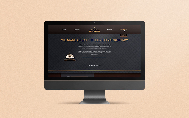
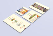
Website Design
The primary goal of the Encore Hospitality website was to confidently introduce potential clients to the EH brand and establish Petr's expertise in managing a diverse portfolio of hotels, from classical to modern. To achieve this, we embraced a design strategy that artfully blends skeuomorphic elements with modern digital aesthetics.
Visitors encounter classic real-world textures such as leather, dark wood, and polished silver, which evoke a sense of tradition and tactile luxury. These are thoughtfully contrasted with clean, flat design features and subtle animations, ensuring a contemporary and engaging user experience. This harmonious blend allowed the website to showcase Petr's versatility and attract a clientele that appreciates both established elegance and forward-thinking approaches. The clear navigation and strategic content placement guide visitors to understand Petr's value proposition and encourage them to connect with Encore Hospitality.


