


Branding for a infrastructure development consulting company
DIPRO Consult, s.r.o. is a Slovak company established in 2009, specializing in consulting services for infrastructure development projects. They provide comprehensive solutions covering every stage of a project: from initial designs and securing project documentation to managing financing applications from EU sources. Their services also include overseeing the implementation of projects, handling project modifications, and delivering final documentation.
Client
DIPRO Consult
My Role
Graphic Designer
Services
Branding
Year
2020
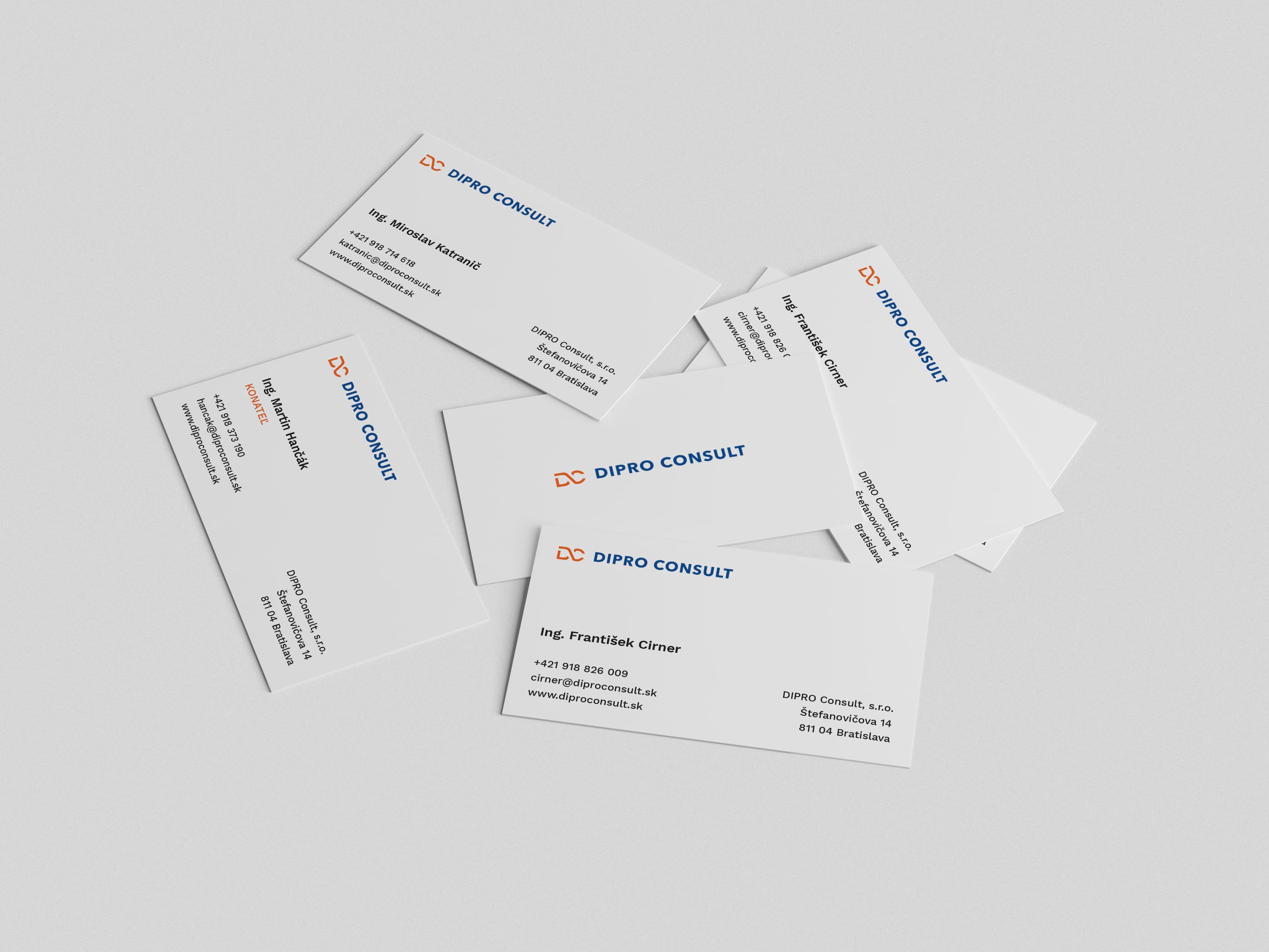
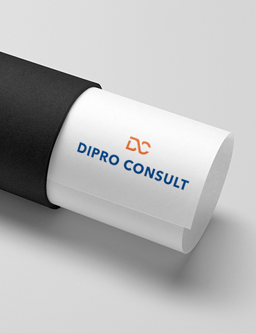
Logo Design
The Dipro Consult logo was designed to be simple, memorable, and recognizable. During the research phase, I analyzed various projects and services that Dipro Consult provides to better understand their clients. Through this process, I identified a few overlapping concepts that became the foundation for the logo mark. Since most of the company’s projects involve infrastructure planning for road and railway developments, I chose a simple symbol of two intersecting roads or railways. This element also connects the company’s initials, D and C, creating a clean, distinctive mark that represents the core services Dipro Consult offers.
To complete the logo, I selected a modern sans-serif typeface to achieve a minimalistic and contemporary look.